Our Approach
Facilitation through communication and collaboration
The ISC Difference
Click here to view how our highly graphical reporting style enables IDMCs to quickly zero in on the information they need.
Facilitation through communication and collaboration
Click here to view how our highly graphical reporting style enables IDMCs to quickly zero in on the information they need.
Our broad experience with clinical trials – and IDMCs –enables us to understand and anticipate the needs of the IDMCs. Beyond producing reports, we engage scientifically with the studies at hand and provide intellectual input.
The ISC assigns a team to each trial consisting of a senior team leader, biostatisticians for the production and validation of reports, and a QA specialist.
Our reporting style is highly graphical and zeros in on what the IDMCs are looking for. This enables the monitoring committees to cover a lot of material in a relatively efficient way. View some examples below.
The ISC takes great care to protect the integrity and confidentiality of trial data, including working in a computing environment that meets key regulatory security standards such as HIPAA Security Rule and FISMA.
The ISC team, particularly the biostatisticians, work closely with the IDMC throughout the entire duration of the trial, from inception through closeout. Many ISC staff have worked at our organization for a long time, and this unique level of continuity is beneficial to all trials, especially long term ones.
The ISC receives periodic transfers of all trial data and is, therefore, able to respond to requests for additional information from the DMC promptly and without unnecessary communication with the trial sponsor or data providers.
The sample graphics below, derived from a simulated database, highlight aspects of the reports that the ISC provides to IDMCs.
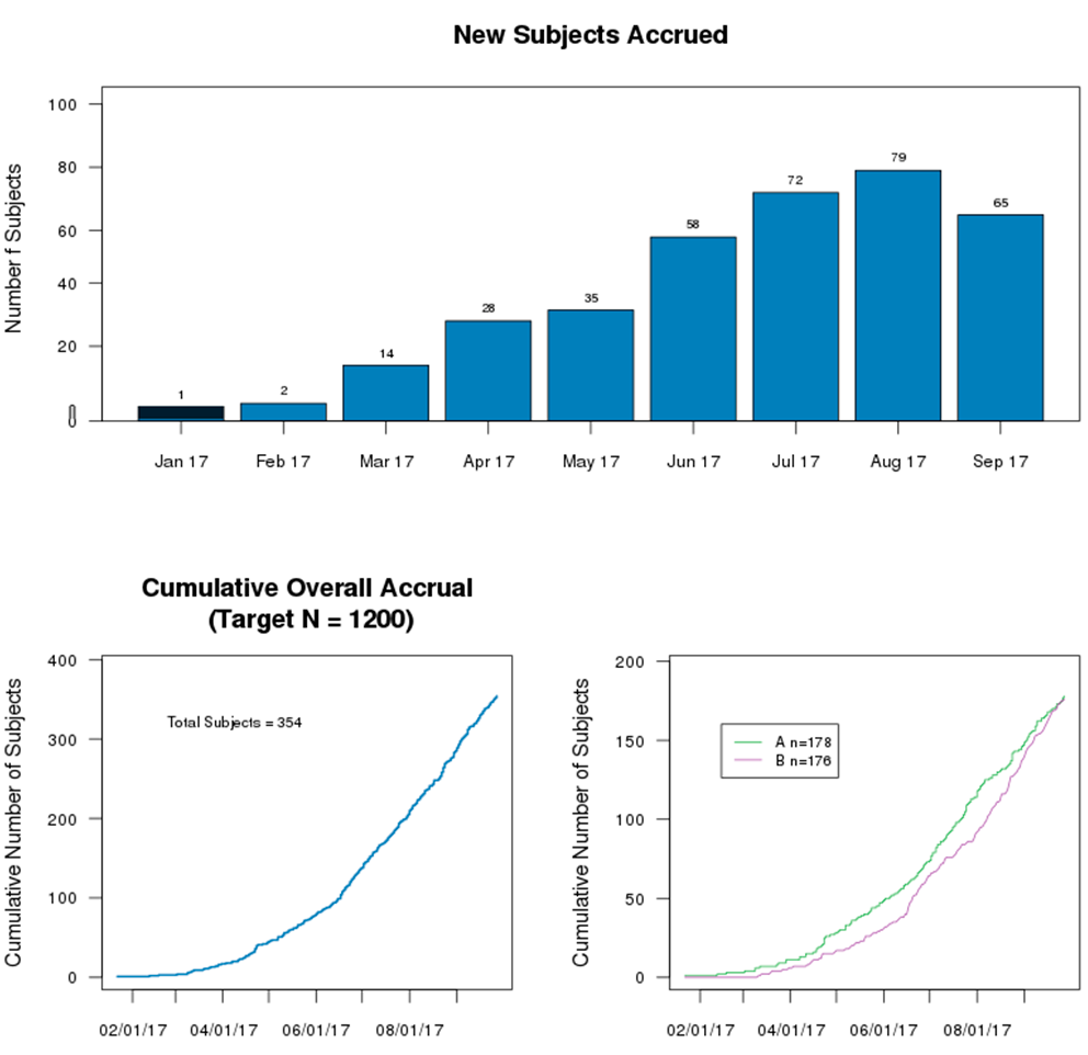
Accrual data of subjects are displayed in a combination of charts, providing an overview and the current status of ongoing clinical trials. The charts may further break down into subpopulations such as states, countries, or other stratifications incorporated in a trial.
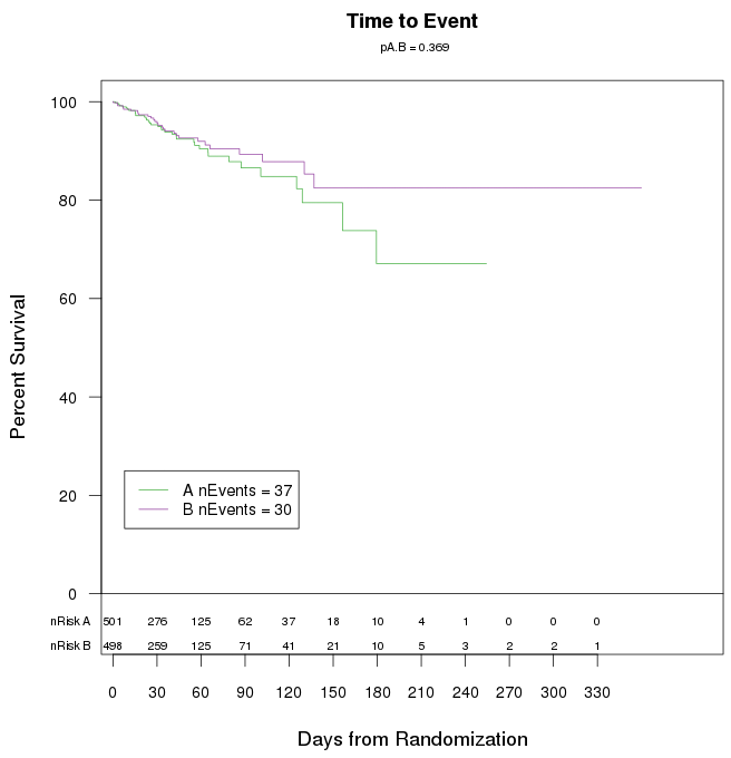
Dichotomous response variables such as death for subjects with variable lengths of follow-up are often displayed as Kaplan-Meier (product-limit) ’survival’ curves across time. The total number of events appear on the plot, as do the numbers of subjects at risk (event-free and uncensored) at various points of follow-up.
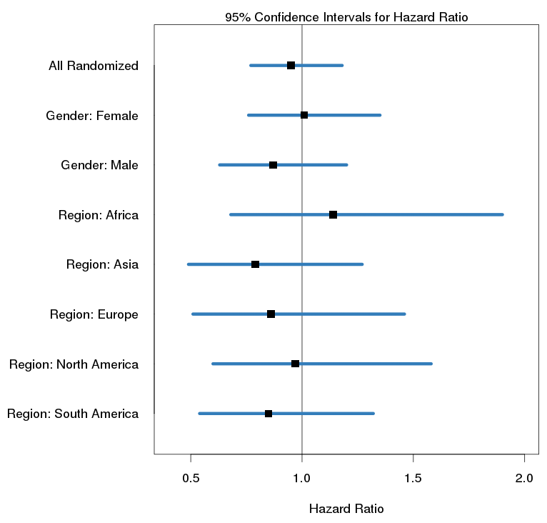
A Forest Plot shows the hazard ratios between treatment groups along with 95% confidence intervals. The analysis is applied to the overall population as well as subpopulations of interest, such as genders, geographical regions, or baseline characteristics.
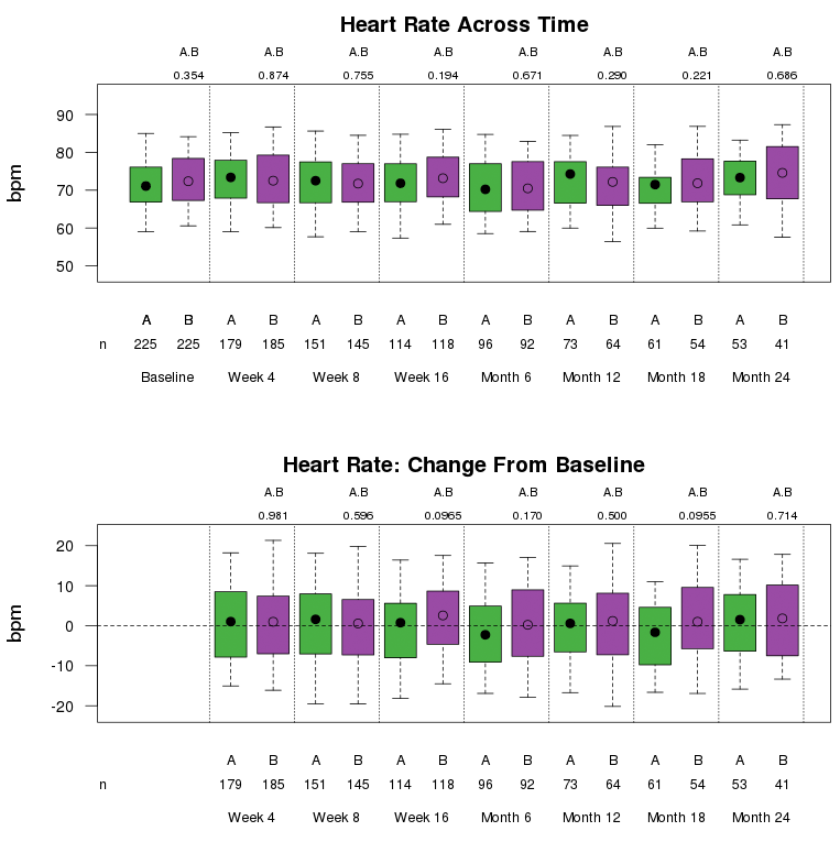
Boxplots display the distribution of continuous data by means of percentiles, including but not limited to physical measures, vital signs, ECG, and laboratory parameters. Boxplots may also be used to display change from baseline or percent change from baseline for each of the continuous variables. Unless otherwise noted, the top and bottom edges of the box represent the 25th and 75th percentiles of the data. The 5th and 95th percentiles are represented by the “whiskers” extending from the top and bottom of the box. The plotting symbol inside the box represents the median of the data.
Simple bar charts are used to display single categorical variables with mutually exclusive categories. Bar charts of related dichotomous variables may sometimes be grouped together to form a multiple bar chart.
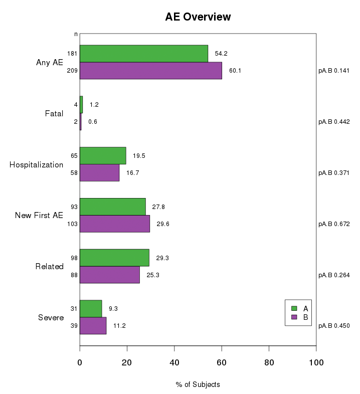
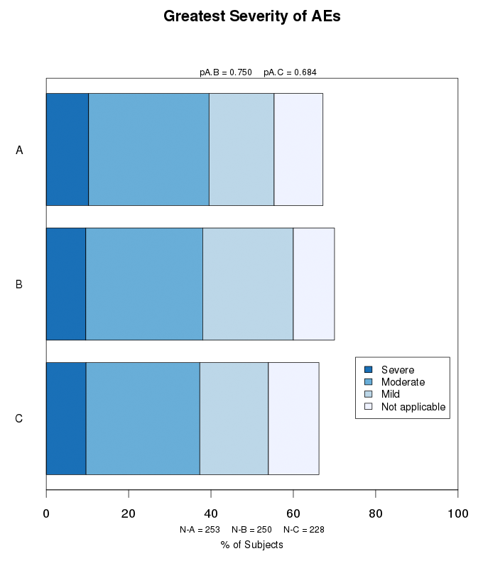
Stacked bar charts are used to show subcategories of AEs, SAEs, or other variables of interest. AEs may be categorized by severity (severe, moderate, mild), relationship to the treatment (related, unrelated), status (resolved, not resolved), or frequency per subject. The percent of subjects within the subcategories are indicated by shading in a stacked bar chart.